
Ad Hoc charts are a flexible, interactive way to explore your data graphically. You can choose different levels of aggregation for rows and columns, change a field from a column to a row, pivot the entire chart, hide chart values, and zoom in to see chart details.
This sections explain how to populate, edit, and format an Ad Hoc chart. Many tasks related to working with charts are very similar to those for tables and crosstabs.
The following video provides an overview of Chart creation, as well as some of the advanced features of the Ad Hoc Editor:
The manner and function in which fields and measures are grouped and used is dependent on the type of Chart selected.
Tables
- Columns: Can be either a field or a measure. In order to create a Table, you must drag at least one field or measure in the columns box.
-
Groups: Only a field may be added to the groups box. If you have a measure (numerical data) that you wish to use to group content within a Table, you must first right-click the measure and select select to use it as a field.
Charts
- Columns: Can be either a field or a measure, but the Chart will not render without the inclusion of at least one measure (as either a column or a row). If a combination of fields and measures are placed in the Chart as columns, you must also select the depth to which to display columns through a slider in the Filters panel.
-
Rows: Can be either a field or a measure, but the Chart will not render without the inclusion of at least one measure (as either a column or a row). If a combination of fields and measures are places in the Chart as rows, you must also select the depth to which to display rows through a slider in the Filters panel.
Crosstabs
- Columns: Can be either a field or a measure, depending on the manner in which you wish to group data in your Crosstab.
-
Rows: Can be either a field or a measure, depending on the manner in which you wish to group data in your Crosstab.
Chart Types
There are a number of chart types to choose from to best represent your information, including:
- Column: compares values displayed as columns.
- Bar: compares values displayed as bars.
- Line: compares values displayed as points connected by lines.
- Area: compares values displayed as shaded areas.
- Spider: compares three or more values on a series of spokes. Spider charts can use columns, lines, or areas to display values.
- Dual and Multi-Axis: display values using two or more measures.
- Time Series: compares time intervals displayed as points connected by lines.
- Scatter: compares values as individual points arrayed across both axes of a chart.
- Bubble: compares three measures displayed as circles of varying sizes arrayed across both axes of a chart.
- Pie: compares values displayed as slices of a circular graph.
- Range: displays values as heat maps.
By default, the Ad Hoc Editor creates a column chart. You can select a different type of chart at any time.
To select a new chart type, complete the following steps:- In the Ad Hoc View panel, click the Detail Selector icon to show the Canvas Options context-menu.
- Select Chart Types from the context-menu. The Select Chart Type window appears.
- Click the type of chart you want to apply to your report. The selected chart type is outlined in blue.
- Leave the Select Chart Type window open to rapidly switch between chart types, or click the Close icon at the top right to close it.
The following table describes the available chart types, and any rules affecting their usage (where required):
Column Charts Column charts compare values displayed as columns 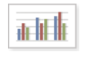
Column. Multiple measures of a group are depicted as individual columns. 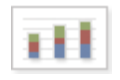
Stacked Column. Multiple measures of a group are depicted as portions of a single column whose size reflects the aggregate value of the group. 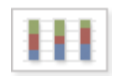
Percent Column. Multiple measures of a group are depicted as portions of a single column of fixed size. 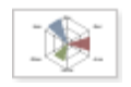
Spider Column. Multiple measures of a group are depicted as portions of individual "columns" along a spoked chart. Area Charts 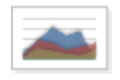
Area. Displays data points connected with a straight line and a color below the line; groups are displayed as transparent overlays. 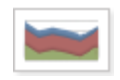
Stacked Area. Displays data points connected with a straight line and a solid color below the line; groups are displayed as solid areas arranged vertically, one on top of another. 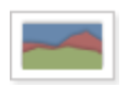
Percent Area. Displays data points connected with a straight line and a solid color below the line; groups are displayed as portions of an area of fixed sized, and arranged vertically one on top of the another. 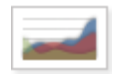
Area Spline. Displays data points connected with a fitted curve and a color below the line; groups are displayed as transparent overlays. 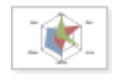
Spider Area. Displays data points connected with straight lines and a solid color between the line and the center of a spoked chart; groups
are displayed as transparent overlays.Range Charts Range charts display values heat maps Roles 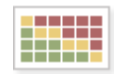
Heat Map. Individual values represented as colors. - One field, followed by one Measure, required in the Columns location.
- One field required in the rows location.
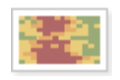
Time Series Heat Map. Individual values across dates/times represented as colors. - One Measure required in the Columns location.
- One Date/Time field required in the Rows location.
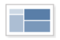
Dual Measure Tree Map. Displays data as color-coded rectangles; the size of each rectangle is proportional to the first measure and the color represents the second measure. - Two Measures required in the Columns location.
- One field required in the Rows location.
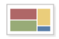
Tree Map. Displays data as rectangles; the size of each rectangle is proportional to the measure of the data it represents. The tree map displays nested rectangles when you have more than one field; the parent rectangle represents the leftmost measure while the nested rectangles represent the current level of aggregation. Click on a parent rectangle to drill down to the nest rectangle. - One Measure required in the Columns location.
- One or more fields required in the Rows location.
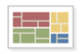
Parent Tree Map. Displays data as nested rectangles; the size of each rectangle is proportional to the measure of the data it represents. The nested rectangles represent the current level of aggregation while the larger rectangle represents the parent level in the hierarchy. Click on a parent rectangle to drill down to the nest rectangles. - One Measure required in the Columns location.
- Two or more Fields required in the Rows location.
Pie Charts Pie charts display values as slices of a circular graph 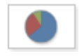
Pie. Multiple measures of a group are displayed as sectors of a circle. 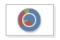
Dual Pie. Multiple measures of a group are displayed as sectors of concentric circles. 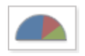
Semi-Pie. Multiple measures of a group are displayed as sectors of a half-circle. Bubble Charts Bubble charts show the correlation between three measures, displayed as disks 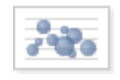
Bubble. Displays first measure as the x-axis, the second measure as the y-axis, and the third measure determines the size of the disk. Scatter Charts Scatter charts show the extent of correlation between the values of observed quantities Roles 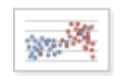
Scatter. Displays first measure as the x-axis, the second measure as the y-axis. Other fields and dimensions in the column group become data points. - Requires exactly two measures.
- Measures must be placed in the Columns location.
Line Charts Line charts compare values displayed as points connected by lines 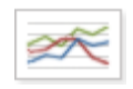
Line. Displays data points connected with straight lines. 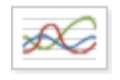
Spline. Displays data points connected with a fitted curve. 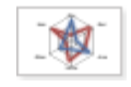
Spider Line. Displays data points connected with straight lines on a spoked chart. Times Series Charts Times Series charts illustrate data points at successive time intervals Roles 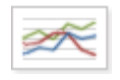
Line. Displays date and time data points connected with straight lines. - Requires a single date/time field in the Rows location.
- Field must be set to the "day" group function.
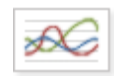
Spline. Displays date and time data points connected with a fitted curve. - Requires a single date/time field in the Rows location.
- Field must be set to the "day" group function.
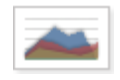
Area. Displays date and time data points connected with a straight line and a color below the line; groups are displayed as transparent overlays. - Requires a single date/time field in the Rows location.
- Field must be set to the "day" group function.
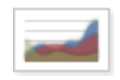
Area Spline. Displays date and time data points connected with a fitted curve and a color below the line; groups are displayed as transparent overlays. - Requires a single date/time field in the Rows location.
- Field must be set to the "day" group function.
Dual and Multi-Axis Charts You can compare two or more measures, using one charting time or multiple charting types, with the charts listed here Roles 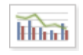
Column Line. Displays leftmost measures as bars, last measure as a line. - Requires two or more measures. Measures must be placed in the Columns location.
- Fields and dimensions can only be placed in the Rows location.
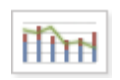
Stacked Column Line. Displays leftmost measures as stacked bars, last measure as a line. - Requires three or more measures.
- Measures must be placed in the Columns location.
- Fields and dimensions can only be placed in the Rows location.
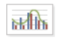
Column Spline. Displays leftmost measures as bars, last measure as a spline. - Requires two or more measures.
- Measures must be placed in the Columns location.
- Fields and dimensions can only be placed in the Rows location.
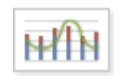
Stacked Column Spline. Displays leftmost measures as stacked bars, last measure as a line. - Requires three or more measures.
- Measures must be placed in the Columns location.
- Fields and dimensions can only be placed in the Rows location.
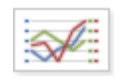
Multi-Axis Line. Displays each measure as a separate axis line. - Requires two or more measures.
- Measures must be placed in the Columns location.
- Fields and dimensions can only be placed in the Rows location.
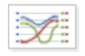
Multi-Axis Spline. Displays each measure as a separate axis spline. - Requires two or more measures.
- Measures must be placed in the Columns location.
- Fields and dimensions can only be placed in the Rows location.
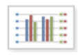
Multi-Axis Column. Displays each measure as a separate axis column. - Requires two or more measures.
- Measures must be placed in the Columns location.
- Fields and dimensions can only be placed in the Rows location.
Bar Charts Bar charts compare values displayed as bars 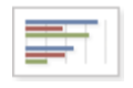
Bar. Multiple measures of a group are depicted as individual bars. 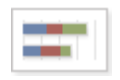
Stacked Bar. Multiple measures of a group are depicted as portions of a single bar whose size reflects the aggregate value of the group. 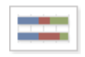
Percent Bar. Multiple measures of a group are depicted as portions of a single bar of fixed size. You can control some aspects of how data points, field names and labels on your chart are displayed, including:
- Whether data points are displayed.
- Showing a measure name on charts including only a single measure.
- Restricting the number of labels displayed.
-
Rotating the direction of label text.
Advanced Chart Formatting
Zoola™ HTML5 Javascript Charts are defined with default formatting. While the Ad Hoc Designer provides some basic formatting control via properties that are selected from the Chart Formatting Dialog, you may require more control over a chart's appearance.
- Placing two slashes at the beginning of a property causes it to be commented out. Use this "trick" to disable a property without having to delete it.
- Property names and Values are case sensitive. Incorrect casing will cause a Property to be ignored.
- If the Properties names or Values are input incorrectly, the chart will not change.
The following chart provides an extensive list of advanced formatting commands. To implement the commands, complete the following steps:
- On the Advanced tab of the Chart Format window, click the Add New Property button.
- In the Property field, enter a command from the Property column of the table below this list.
- In the Value column, enter the necessary value as identified in the Value column of the table, and explained in the Description column of the table.
-
To save the new formatting command, click the
 button.
-
To see the change in your chart with the window still open, click the Apply button.
To apply your change and close the window, click the OK button.
Property Value Description chart.alignTicks true or false When using multiple axis, the ticks of two or more opposite axes will automatically be aligned by adding ticks to the axis or axes with the least ticks. This can be prevented by setting alignTicks to false. If the grid lines look messy, it's a good idea to hide them for the secondary axis by setting gridLineWidth to 0. Defaults to true. For example, value set to:
false
chart.backgroundColor "color" Sets the back ground color of the entire chart. The color value may be a color name (such as 'Black') or a hexadecimal code enclosed in double quotes. For example, value set to:
"Grey"
Notes:
- Color Names and Hex Codes should not contain spaces.
- Hex codes should begin with #.
- If an unknown color name or code is defined, a black back ground is displayed.
chart.borderColor "color" The color of the outer chart border. Defaults to #4572A7. For example, value set to:
"Green"
Notes:
- You must include chart.borderWidth in order to work
chart.borderRadius Value The corner radius of the outer chart border. Defaults to 0. For example, value set to:
5
Notes:
- You must include and chart.borderWidth in order to work
- You can add chart.borderColor to change border color
chart.borderWidth Value The pixel width of the outer chart border. Defaults to 0. For example, value set to:
2
Notes:
- You can add chart.borderColor to change border color
chart.plotBackgroundColor "color"
Sets the back ground color of the chart plot area. The color value may be a color name (such as 'Black') or a hexadecimal code enclosed in double quotes. For example, value set to:
"Black"
Notes:
- Color Names and Hex Codes should not contain spaces.
- Hex codes should begin with #.
- If an unknown color name or code is defined, a black back ground is displayed.
chart.height Value An explicit height for the chart. By default the height is calculated from the offset height of the containing element, or 400 pixels if the containing element's height is 0. For example, value set to:
200
chart.ignoreHiddenSeries true or false If true, the axes will scale to the remaining visible series once one series is hidden. If false, hiding and showing a series will not affect the axes or the other series. For stacks, once one series within the stack is hidden, the rest of the stack will close in around it even if the axis is not affected. For example, value set to:
true
chart.inverted true or false Whether to invert the axes so that the x axis is vertical and y axis is horizontal. For example, value set to:
true
chart.margin Array The margin between the outer edge of the chart and the plot area. The numbers in the array designate top, right, bottom and left respectively. Use the options marginTop, marginRight, marginBottom and marginLeft for shorthand setting of one option.
Since version 2.1, the margin is 0 by default. The actual space is dynamically calculated from the offset of axis labels, axis title, title, subtitle and legend in addition to the spacingTop, spacingRight, spacingBottom and spacingLeft options.
Defaults to [null]. For example, value set to:
[100, 80, 60, 80]
chart.marginBottom Value The margin between the bottom outer edge of the chart and the plot area. Use this to set a fixed pixel value for the margin as opposed to the default dynamic margin. See also. For example, value set to:
100
chart.marginLeft Value The margin between the left outer edge of the chart and the plot area. Use this to set a fixed pixel value for the margin as opposed to the default dynamic margin. See also spacingLeft. For example, value set to:
150
chart.marginRight Value The margin between the right outer edge of the chart and the plot area. Use this to set a fixed pixel value for the margin as opposed to the default dynamic margin. See also spacingRight. For example, value set to:
270
chart.marginTop Value The margin between the top outer edge of the chart and the plot area. Use this to set a fixed pixel value for the margin as opposed to the default dynamic margin. See also spacingTop. For example, value set to:
30
chart.panKey String Allows setting a key to switch between zooming and panning. For example, value set to:
"shift"
chart.panning true or false Allow panning in a chart. Defaults to false. For example, value set to:
true
chart.plotBackgroundImage String The URL for an image to use as the plot background. To set an image as the background for the entire chart, set a CSS background image to the container element. Note that for the image to be applied to exported charts, its URL needs to be accessible by the server. For example, value set to:
"insert URL"
chart.plotBorderColor "color" The color of the inner chart or plot area border. Defaults to #C0C0C0. For example, value set to:
"blue"
chart.plotBorderWidth Value The pixel width of the plot area border. Defaults to 0. For example, value set to:
2
chart.polar true or false When true, cartesian charts like line, spline, area and column are transformed into the polar coordinate system. Requires highcharts-more.js . Defaults to false . For example, value set to:
true
chart.reflow true or false Whether to reflow the chart to fit the width of the container div on resizing the window. Defaults to true . For example, value set to:
false
chart.resetZoomButton.position.x
chart.resetZoomButton.position.yValue Affects the position of the "Reset zoom" button. This is an object that can hold the properties align, verticalAlign, x and y. For example, value set to:
-100
10
chart.resetZoomButton.theme Object A collection of attributes for the button. The object takes SVG attributes like fill, stroke, stroke-width or r, the border radius. The theme also supports style, a collection of CSS properties for the text. Equivalent attributes for the hover state are given in theme.states.hover. For example, define the property as follows:
chart.resetZoomButton.theme.fill
Set value to:
"red"
chart.selectionMarkerFill "color" The background color of the marker square when selecting (zooming in on) an area of the chart. Defaults to rgba(69,114,167,0.25). For example, value set to:
"blue"
chart.showAxes true or false Whether to show the axes initially. This only applies to empty charts where series are added dynamically, as axes are automatically added to cartesian series. Defaults to false. For example, value set to:
false
chart.spacing Array The distance between the outer edge of the chart and the content, like title, legend, axis title or labels. The numbers in the array designate top, right, bottom and left respectively. Use the options spacingTop, spacingRight, spacingBottom and spacingLeft options for shorthand setting of one option. Defaults to [10, 10, 15, 10]. For example, value set to:
[20, 20, 25, 20]
chart.style CSSObject Additional CSS styles to apply inline to the container div. Note that since the default font styles are applied in the renderer, it is ignorant of the individual chart options and must be set globally.
Defaults to:
<span style="font-size:12px;">style: { fontFamily: '"Lucida Grande", "Lucida Sans Unicode",Verdana, Arial, Helvetica, sans-serif', // default font fontSize: '12px' }</span>
Defaults to:
Lucida Sans Unicode\", Verdana, Arial, Helvetica, sans-serif","fontSize":"12px"}
For example, value set to:'serif'
chart.type "waterfall" or"gauge" or
"solidgauge"
The default series type for the chart. Use this to create a "waterfall" chart or a "gauge". For example, value set to:
"waterfall"
Notes:
Drawing Gauges requires addtional formatting commands to create the desired appearance.
For example, a SolidGauge, uses the following properties:
chart.type with a value of "solidgauge"
pane.startAngle with a value of -90
pane.endAngle with a value of 90
pane.background.innerRadius with a value of "60%"
yAxis.min with a value of 0
yAxis.minorTickInterval with a value of null
yAxis.lineWidth with a value of 0
yAxis.tickWidth with a value of 0
plotOptions.solidgauge.dataLabels.borderWidth with a value of 0
pane.background.shape with a value of "arc"
yAxis.max with a value of 100000
plotOptions.solidgauge.dataLabels.y with a value of -40
colors with a value of ["skyblue"]
yAxis.labels.y with a value of 12
yAxis.tickPixelInterval with a value of 10000chart.width Value An explicit width for the chart. By default the width is calculated from the offset width of the containing element. For example, value set to:
350
chart.zoomType "Value" Decides in what dimensions the user can zoom by dragging the mouse. Can be one of x, y or xy. For example, value set to:
"xy"
colors ["Color1", "Color2", "ColorN"'] A comma seperated list of color values for chart series data. The color value may be a color name (such as 'Blue', 'LightSeaGreen', 'Purple') or hexadecimal codes enclosed in double quotes. For example, value set to:
["red", "DarkTurquoise", "blue", "green", "magenta", "purple", "black", "yellow", "brown", "grey", "gold", "orange", "#7cb5ec"]
If there are more series in the chart than specfied in the color list, then default colors are used for the remainig chart series:
Notes:
- Color Names and Hex Codes should not contain spaces.
- Hex codes should begin with #.
- If an unknown color name or code is defined, a black series value is returned.
legend.align "left" or "right" or"center" Sets the left-to-right alignment of a chart legend. For example, value set to:
"left"
legend.backgroundColor "color" The background color of the legend. For example, value set to:
"blue"
legend.borderColor color The color of the drawn border around the legend. Defaults to #909090. For example, value set to:
"red"
legend.borderRadius Value The border corner radius of the legend. Defaults to 0. For example, value set to:
10
legend.borderWidth Value The width of the drawn border around the legend. Defaults to 0. For example, value set to:
0
legend.enabled true or false Enable or disable the legend. Defaults to true. For example, value set to:
false
legend.floating true or false When the legend is floating, the plot area ignores it and is allowed to be placed below it. Defaults to false. For example, value set to:
true
legend.itemDistance Value In a legend with horizontal layout, the itemDistance defines the pixel distance between each item. Defaults to 20. For example, value set to:
50
legend.itemHiddenStyle.color CSSObject CSS styles for each legend item when the corresponding series or point is hidden. Only a subset of CSS is supported, notably those options related to text. Properties are inherited from style unless overridden here. Defaults to:
<span style="font-size:12px;">itemHiddenStyle: { color: '#CCC'</span>. For example, value set to:"green"
legend.itemHoverStyle.color CSSObject CSS styles for each legend item in hover mode. Only a subset of CSS is supported, notably those options related to text. Properties are inherited from style unless overridden here. Defaults to:
<span style="font-size:12px;">itemHoverStyle: {color: '#000'}</span>. For example, value set to:"SandyBrown"
legend.itemMarginBottom Value The pixel bottom margin for each legend item. Defaults to 0. For example, value set to:
4
legend.itemMarginTop Value The pixel top margin for each legend item. Defaults to 0. For example, value set to:
5
legend.itemStyle.color CSSObject CSS styles for each legend item. Only a subset of CSS is supported, notably those options related to text. Defaults to
{ "color": "#333333", "cursor": "pointer", "fontSize": "12px", "fontWeight": "bold" }. For example, value set to:
"gray"legend.itemStyle.fontSize CSSObject CSS styles for each legend item. Only a subset of CSS is supported, notably those options related to text. Defaults to
{ "color": "#333333", "cursor": "pointer", "fontSize": "12px", "fontWeight": "bold" }. For example, value set to:
"16px"
legend.itemStyle.fontWeight CSSObject CSS styles for each legend item. Only a subset of CSS is supported, notably those options related to text. Defaults to
{ "color": "#333333", "cursor": "pointer", "fontSize": "12px", "fontWeight": "bold" }. For example, value set to:
"bold"
legend.itemWidth Value The width for each legend item. This is useful in a horizontal layout with many items when you want the items to align vertically. For example, value set to:
180
legend.layout String The layout of the legend items. Can be one of "horizontal" or "vertical". Defaults to horizontal. For example, value set to:
"vertical"
legend.navigation.activeColor "color" The color for the active up or down arrow in the legend page navigation. Defaults to #3E576F.
"#9FF084"
legend.navigation.animation true or false How to animate the pages when navigating up or down. A value of true applies the default navigation given in the chart.animation option. Additional options can be given as an object containing values for easing and duration. . Defaults to true. For example, value set to:
false
legend.navigation.arrowSize Value The pixel size of the up and down arrows in the legend paging navigation. Defaults to 12. For example, value set to:
16
legend.navigation.inactiveColor "color" The color of the inactive up or down arrow in the legend page navigation. Defaults to #CCC. For example, value set to:
"red"
legend.navigation.style.fontWeight CssObject Text styles for the legend page navigation. For example, value set to:
"bold"
legend.padding Value The inner padding of the legend box. Defaults to 8. For example, value set to:
4
legend.reversed true or false Whether to reverse the order of the legend items compared to the order of the series or points as defined in the configuration object. Defaults to false. For example, value set to:
true
legend.rtl true or false Whether to show the symbol on the right side of the text rather than the left side. This is common in Arabic and Hebraic. Defaults to false. For example, value set to:
true
legend.shadow true or false | Object Whether to apply a drop shadow to the legend. A backgroundColor also needs to be applied for this to take effect. Since 2.3 the shadow can be an object configuration containing color, offsetX,offsetY, opacity and width. Defaults to false. For example, value set to:
true
legend.symbolHeight Value The pixel height of the symbol for series types that use a rectangle in the legend. Defaults to the font size of legend items. For example, value set to:
4
legend.symbolPadding Value The pixel padding between the legend item symbol and the legend item text. Defaults to 5. For example, value set to:
12
legend.symbolRadius Value The border radius of the symbol for series types that use a rectangle in the legend. Defaults to 0. For example, value set to:
10
legend.symbolWidth Value The pixel width of the legend item symbol. Defaults to 16. For example, value set to:
30
legend.title.style.fontSize CSSObject Generic CSS styles for the legend title. Defaults to {"fontWeight":"bold"}. For example, value set to:
20
legend.useHTML true or false Whether to use HTML to render the legend item texts. Prior to 4.1.7, when using HTML, legend.navigation was disabled. For example, value set to:
true
legend.verticalAlign "top" or"bottom" or"center" Sets the top-to-bottom alignment of a chart legend. For example, value set to:
"top"
legend.width Value The width of the legend box. For example, value set to:
75
legend.backgroundColor "color" Sets the background color of the chart legend. For example, value set to:
"silver"
Notes:
- Color Names and Hex Codes should not contain spaces.
- Hex codes should begin with #.
- If an unknown color name or code is defined, a black background is displayed.
legend.title.text String Displays a legend tile. For example, value set to:
Key:
legend.x Value The x offset of the legend relative to its horizontal alignment align within chart.spacingLeft and chart.spacingRight. Negative x moves it to the left, positive x moves it to the right. Defaults to 0. For example, value set to:
-105
legend.y Value The vertical offset of the legend relative to it's vertical alignment verticalAlignwithin chart.spacingTop and chart.spacingBottom. Negative y moves it up, positive y moves it down. Defaults to 0. For example, value set to:
20
pane.background.backgroundColor "color" For example, value set to:
"red"
pane.background.shape String For example, value set to:
"arc"
pane.background.innerWidth Value For example, value set to:
30
pane.background.outerWidth Value For example, value set to:
20
pane.background.borderWidth Value For example, value set to:
10
pane.background.borderColor "color" For example, value set to:
"blue"
plotOptions.pie.innerSize "Value" Sets the size of a hole in Pie Charts. Value can either be a pixel number or % of Pie enclosed in double quotes. For example, a value of:
"50%"
plotOptions.series.dataLabels.enabled true or false Displays data values on a chart. For example, value set to:
true
plotOptions.series.dataLabels.format {format string} Applies a formatting to data labels. For example:
{point.y:.2f} causes data values to display with 2 decimals
{point.y:,.0f} causes data vlaues to display with thousands seperator and zero decimals and causes the chart tp draw as follows:
Another example for percent bar chart:
{point.percentage:.1f} %
Notes:
Requires the plotOptions.series.dataLabels.enabled format property to be set
plotOptions.series.dataLabels.rotation Value Rotates data labels from 0 to 360 degrees. For example, value set to:
270
Notes:
Requires the plotOptions.series.dataLabels.enabled format property to be set
plotOptions.series.dataLabels.x
plotOptions.series.dataLabels.y
Value Defines datalabel offwet position from either X or Y axis. For example, to change the label position on the Y-Axis, use plotOptions.series.dataLabels.y with a value of:
-20
plotOptions.series.pointWidth Value For example, value set to:
17
series.shadow true or false Whether to apply a drop shadow to the graph line. Since 2.3 the shadow can be an object configuration containing color, offsetX, offsetY, opacity and width. Defaults to false. For example, value set to:
false
series.borderWidth Value For example, value set to:
0
series.groupPadding Value For example, value set to:
-4
series.pointPadding Value For example, value set to:
-.5
subtitle.text
title.text
String Displays a Chart Title or Subtitle text string. For example, a title and subtitle values of:
Fresh Food Sales Performance
State Tree Map by Demographic
title.text "Value" The title of the chart. To disable the title, set the text to null. Defaults to Chart title. For example, value set to:
"Title"
tooltip.followPointer true or false Whether the tooltip should follow the mouse as it moves across columns, pie slices and other point types with an extent. By default it behaves this way for scatter, bubble and pie series by override in the plotOptions for those series types.
For touch moves to behave the same way, followTouchMove must be true also.
Defaults to false. For example, value set to:
true
tooltip.footerFormat "Value" A string to append to the tooltip format. Defaults to false. For example, value set to:
"</table>"
tooltip.headerFormat "Value" The HTML of the tooltip header line. Variables are enclosed by curly brackets. Available variables are point.key, series.name, series.color and other members from the point and seriesobjects. The point.key variable contains the category name, x value or datetime string depending on the type of axis. For datetime axes, the point.key date format can be set using tooltip.xDateFormat.
Defaults to <span style="font-size: 10px">{point.key}</span><br/>. For example, value set to:
"<table>"
tooltip.pointFormat "Value" The HTML of the point's line in the tooltip. Variables are enclosed by curly brackets. Available variables are point.x, point.y, series.name and series.color and other properties on the same form. Furthermore, point.y can be extended by the tooltip.valuePrefix and tooltip.valueSuffix variables. This can also be overridden for each series, which makes it a good hook for displaying units.
Defaults to <span style="color:{point.color}">\u25CF</span> {series.name}: <b>{point.y}</b><br/>. For example, value set to:
""
tooltip.useHTML true or false Use HTML to render the contents of the tooltip instead of SVG. Using HTML allows advanced formatting like tables and images in the tooltip. It is also recommended for rtl languages as it works around rtl bugs in early Firefox. Defaults to false. For example, value set to:
true
xAxis.alternateGridColor Value When using an alternate grid color, a band is painted across the plot area between every other grid line. For example, value set to:
"false"
xAxis.gridLineWidth Value The width of the grid lines extending the ticks across the plot area. Defaults to 0. For example, value set to:
5
xAxis.labels.enabled true or false Enable or disable the axis labels. Defaults to true. For example, value set to:
false
xAxis.tickWidth Value The pixel width of the major tick marks. Defaults to 1. For example, value set to:
0
xAxis.title.margin Value The pixel distance between the axis labels or line and the title. Defaults to 0 for horizontal axes, 10 for vertical. For example, value set to:
16
xAxis.title.style.fontSize "Value" For example, value set to:
"20px"
xAxis.title.style.letterSpacing "Value" For example, value set to:
"3px"
xAxis.title.text Value The actual text of the axis title. It can contain basic HTML text markup like <b>, <i> and spans with style. For example, value set to:
"title"
xAxis.type Value The type of axis. Can be one of "linear", "logarithmic", "datetime" or "category". In a datetime axis, the numbers are given in milliseconds, and tick marks are placed on appropriate values like full hours or days. In a category axis, the point names of the chart's series are used for categories, if not a categories array is defined. Defaults to linear. yAxis.alternateGridColor
xAxis.alternateGridColor
"color" Sets alternating bands of grid colors along either the x-axis or y-axis of the chart plot area. The color value may be a color name (such as 'Black') or a hexadecimal code enclosed in double quotes. For example, a y-axis value set to:
"Pink"
Notes:
- Color Names and Hex Codes should not contain spaces.
- Hex codes should begin with #.
- If an unknown color name or code is defined, a black series value is returned.
yAxis.gridLineWidth
xAxis.gridLineWidth
Value Sets the width of chart axis gridlines in pixels. For example, a y-axis value set to:
0
yAxis.labels.distance Value Angular gauges and solid gauges only. The label's pixel distance from the perimeter of the plot area. Defaults to 15. For example, value set to:
20
yAxis.labels.rotation Value Rotation of the labels in degrees. Defaults to 0. For example, value set to:
"auto"
yAxis.lables.style.fontSize CSSObject CSS styles for the label. Use whiteSpace: 'nowrap' to prevent wrapping of category labels. Use textOverflow: 'none' to prevent ellipsis (dots). Defaults to{"color":"#6D869F","fontWeight":"bold"}.
For example, value set to:
"12px"
yAxis.min Value The minimum value of the axis. If null the min value is automatically calculated.
If the startOnTick option is true, the min value might be rounded down.
The automatically calculated minimum value is also affected by floor, minPadding, minRange as well as series.threshold and series.softThreshold. For example, value set to:
0
yAxis.max Value The maximum value of the axis. If null, the max value is automatically calculated. If the endOnTick option is true, the max value might be rounded up. The actual maximum value is also influenced bychart.alignTicks. For example, value set to:
300000
yAxis.minorTickPosition String The position of the minor tick marks relative to the axis line. Can be one of inside and outside. Defaults to outside. For example, value set to:
"inside"
yAxis.tickPosition String The position of the major tick marks relative to the axis line. Can be one of inside and outside. Defaults to outside. For example, value set to:
"outside"
yAxis.title.margin Value The pixel distance between the axis labels and the title. Positive values are outside the axis line, negative are inside. Defaults to 40. For example, value set to:
8
yAxis.title.style.fontSize "Value" CSS styles for the title. When titles are rotated they are rendered using vector graphic techniques and not all styles are applicable. Defaults to { "color": "#707070", "fontWeight": "bold" }. For example, value set to:
"18px"
yAxis.title.text Value The actual text of the axis title. Horizontal texts can contain HTML, but rotated texts are painted using vector techniques and must be clean text. The Y axis title is disabled by setting the text option tonull. Defaults to Values. For example, value set to:
"Store Sales"
yAxis.type
xAxis.type
"logarithmic" "datetime" "category"
"logarithmic"
or
"datetime"
The type of axis. Can be one of "linear", "logarithmic", "datetime" or "category". In a datetime axis, the numbers are given in milliseconds, and tick marks are placed on appropriate values like full hours or days. In a category axis, the point names of the chart's series are used for categories, if not a categories array is defined.
For example, the y-axis value set to:
"logarithmic"
Comments
Article is closed for comments.