
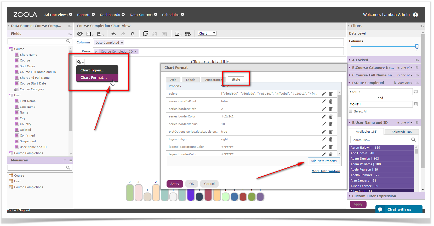
To style any chart, login to Zoola Analytics and open any existing chart-based Ad Hoc View and click the properties icon and choose "Chart Format..." This will open the Chart Format dialog and you can click the "Style" tab and enter the following properties.
Bar and Column Charts
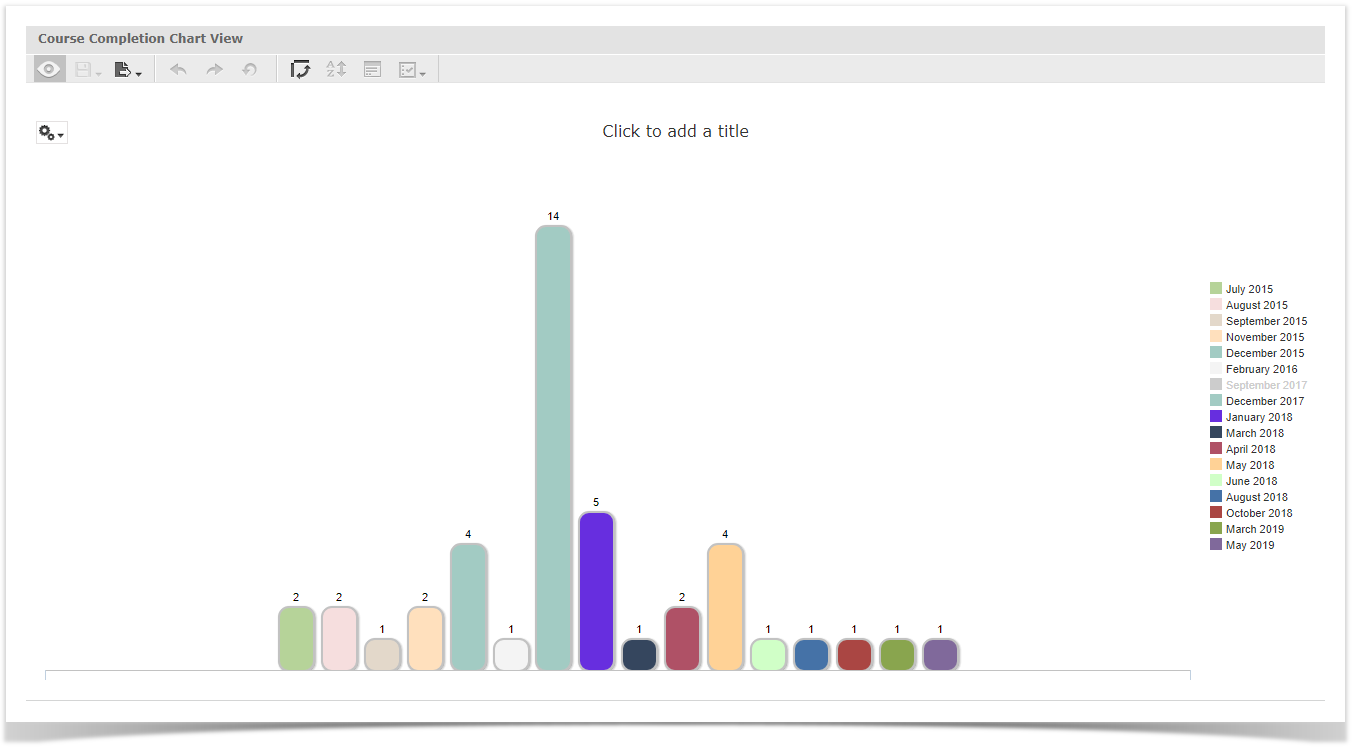
Example
Properties
| Property | Value |
|---|---|
| colors | ["#b6d399", "#f6dede", "#e3d8ca", "#ffe0bd", "#a2cbc3", "#f4f4f4", "#6897bb", "#a2cbc3", "#672edf", "#35465e", "#af5166", "#ffd296", "#d0ffc7"] |
| series.colorByPoint | false |
| series.borderWidth | 2 |
| series.borderColor | #c2c2c2 |
| series.borderRadius | 10 |
| plotOptions.series.dataLabels.enabled | true |
| legend.align | right |
| legend.backgroundColor | #FFFFFF |
| legend.borderColor | #FFFFFF |
| legend.verticalAlign | middle |
| xAxis.labels.enabled | false |
| yAxis.labels.enabled | false |
| legend.itemStyle | {"color": "#333333", "cursor": "pointer", "fontSize": "11px", "fontWeight": "normal", "textOverflow": "ellipsis"} |
| plotOptions.column.dataLabels.style.fontSize | 11px |
| plotOptions.series.dataLabels.style.fontWeight | normal |
| xAxis.gridLineColor | transparent |
| yAxis.gridLineColor | transparent |
| chart.style.fontFamily | Helvetica, Verdana, Arial, Georgia, sans-serif |
| xAxis.lineColor | #c2c2c2 |
| legend.itemMarginBottom | 2 |
| legend.itemMarginTop | 2 |
Scatter Charts
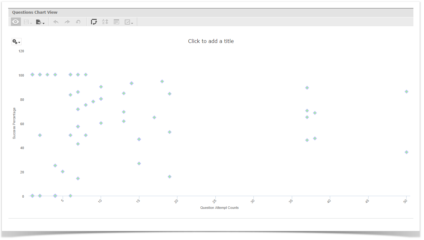
Example
Properties
| Property | Value |
|---|---|
| legend.layout | vertical |
| legend.align | left |
| legend.verticalAlign | top |
| legend.floating | true |
| plotOptions.scatter.marker.radius | 5 |
| plotOptions.scatter.marker.symbol | diamond |
| plotOptions.scatter.marker.states.hover.fillColor | #C2C2C2 |
| plotOptions.scatter.marker.states.hover.lineColor | #000000 |
| plotOptions.scatter.marker.fillColor | #a1f78f |
| plotOptions.scatter.marker.lineColor | #bbbcfc |
| plotOptions.scatter.marker.lineWidth | 2px |
| xAxis.gridLineColor | transparent |
| yAxis.gridLineColor | transparent |
| chart.style.fontFamily | Helvetica, Verdana, Arial, Georgia, sans-serif |
| chart.spacingBottom | 30 |
For Pie Charts
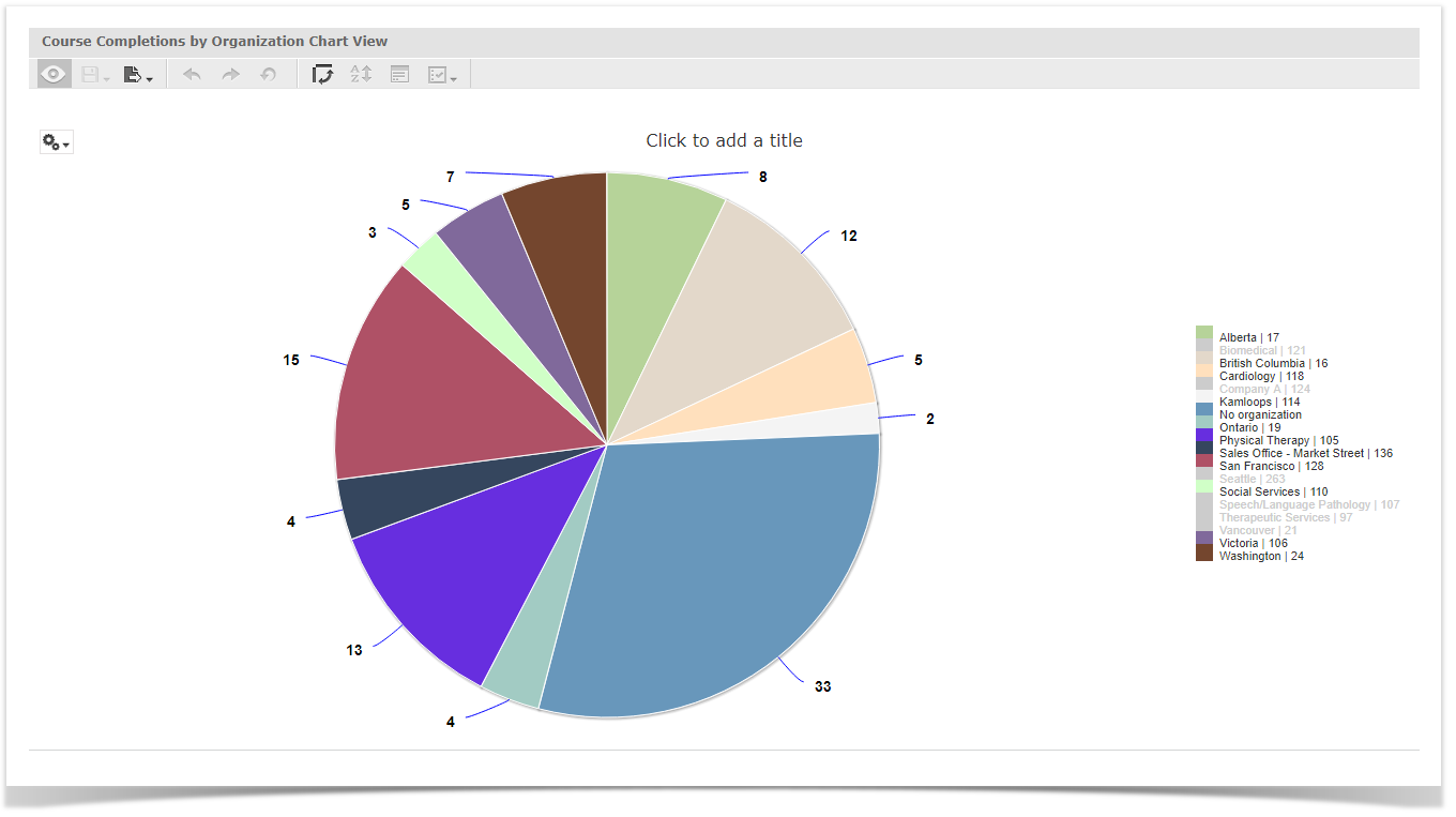
Example
Properties
| Property | Value |
|---|---|
| colors | ["#b6d399", "#f6dede", "#e3d8ca", "#ffe0bd", "#a2cbc3", "#f4f4f4", "#6897bb", "#a2cbc3", "#672edf", "#35465e", "#af5166", "#ffd296", "#d0ffc7"] |
| series.dataLabels.enabled | true |
| legend.align | right |
| legend.backgroundColor | #FFFFFF |
| legend.borderColor | #FFFFFF |
| legend.verticalAlign | middle |
| legend.itemStyle | {"color": "#333333", "cursor": "pointer", "fontSize": "11px", "fontWeight": "normal", "textOverflow": "ellipsis"} |
| chart.style.fontFamily | Helvetica, Verdana, Arial, Georgia, sans-serif |
| series.dataLabels.connectorColor | #0000FF |
| series.dataLabels.distance | 30 |
| series.dataLabels.format | {y} |
| chart.style.fontSize | 16px |
| series.dataLabels.style | {"color": "contrast", "fontSize": "14px", "fontWeight": "bold", "textOutline": "1px contrast" } |
For Line and Area Charts
Example
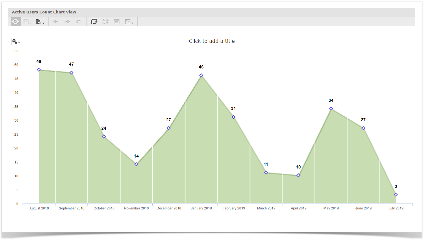
Properties
| Property | Value |
|---|---|
| colors | ["#b6d399", "#f6dede", "#e3d8ca", "#ffe0bd", "#a2cbc3", "#f4f4f4", "#6897bb", "#a2cbc3", "#672edf", "#35465e", "#af5166", "#ffd296", "#d0ffc7"] |
| plotOptions.area.marker.symbol | diamond |
| plotOptions.area.marker.fillColor | #FFFFFF |
| plotOptions.area.marker.lineColor | #5546db |
| plotOptions.area.marker.lineWidth | 2px |
| plotOptions.area.marker.radius | 5 |
| chart.style.fontFamily | Helvetica, Verdana, Arial, Georgia, sans-serif |
| series.dataLabels.enabled | true |
| series.dataLabels.style | {"color": "contrast", "fontSize": "14px", "fontWeight": "bold", "textOutline": "1px contrast" } |
| series.dataLabels.padding | 20 |
| xAxis.labels.rotation | 0 |
| yAxis.gridLineColor | transparent |
| xAxis.gridLineColor | #FFFFFF |
| xAxis.gridLineWidth | 2px |
| xAxis.gridZIndex | 4 |
Comments
Article is closed for comments.